Crowd Safety Training
Crowd Safety Training operates within the event safety and crowd management sector, delivering industry-focused training to professionals working in high-capacity environments. I was brought on to develop a set of visual communications aimed at strengthening their brand presence and improving how their services are presented to a specialist audience.
The project centred on refining their outward-facing materials to ensure clearer messaging, stronger visual consistency, and greater impact across key touchpoints. The goal was to elevate the overall quality of their communications while maintaining a tone that reflects the professionalism of the sector.
As part of this, I designed a print advertisement for The Crowd Magazine and produced a series of social media tiles for February 2026, creating a more cohesive and engaging visual approach tailored to industry professionals.
Deliverables
Social Media
Print Design
Social Media
Print Design
Sector
Crowd Safety
Course Provider
Crowd Safety
Course Provider
Year
2026
2026
Project Responsibilities:
✤ Developed visual assets aimed at increasing brand visibility within the crowd safety sector
✤ Improved clarity of messaging and overall consistency across key communication channels
✤ Designed a print advertisement for The Crowd Magazine
✤ Created a series of social media assets for February 2026, tailored to a professional audience
✤ Maintained a cohesive visual identity aligned with industry standards
✤ Adapted content to meet the expectations of a specialist audience
✤ Translated technical information into clear, accessible visual formats
Additional Credits:
✤ Photography - Envato Elements
✤ Photography - Envato Elements

Image Rights: Envato Elements
Pain Points:
Prior to this project, Crowd Safety Training’s marketing materials lacked visual consistency and a clearly defined structure, which reduced their overall impact and professionalism. Messaging was often unclear or too technical, making it difficult to quickly communicate the value of their training to a busy, industry-specific audience.
In addition, there was limited cohesion between print and digital outputs, and social media content lacked a strong, recognisable visual identity. These issues highlighted the need for a more refined and unified approach to improve clarity, strengthen brand presence, and better engage their target audience.
Solutions:
In response, a more structured and cohesive visual approach was implemented to strengthen both clarity and brand recognition. Messaging was refined to ensure key information could be understood quickly, while maintaining a professional tone suited to the sector. A consistent visual identity was applied across all outputs, improving alignment between print and digital materials.
The advertisement for The Crowd Magazine was designed to present services in a clear and authoritative way, while the social media assets introduced a more engaging and recognisable style tailored to online platforms. Together, these improvements resulted in more effective communication and a stronger, more unified brand presence.
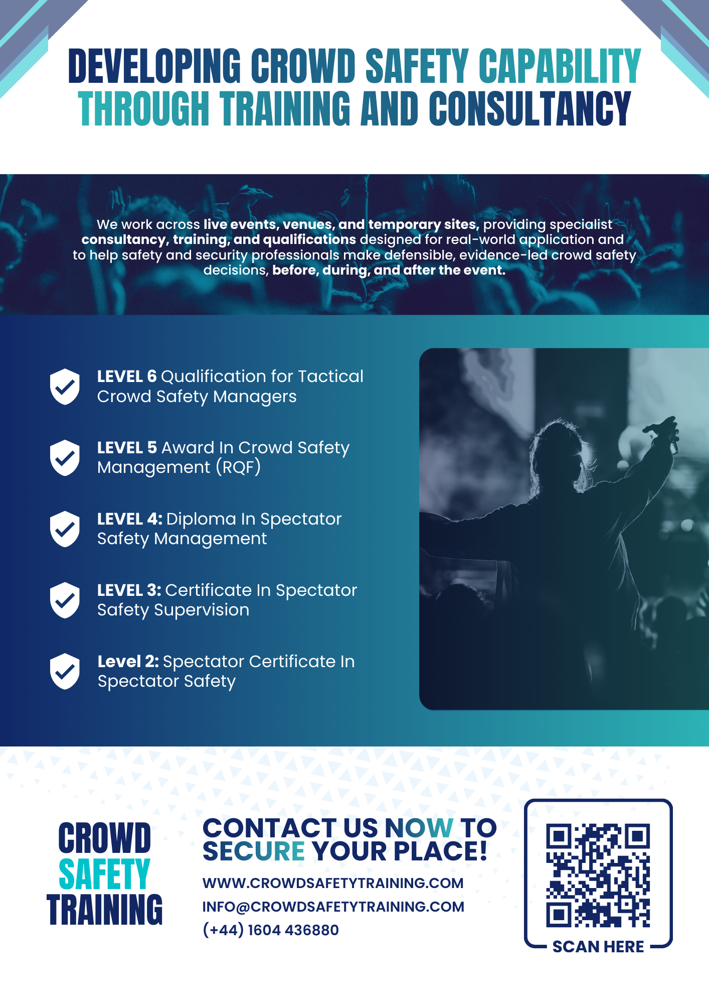
The Crowd Magazine Advert:
This advertisement was designed for publication in The Crowd Magazine, with the aim of strengthening Crowd Safety Training’s visibility within a specialist industry audience. The design focuses on clear communication and structured content, using a strong headline to establish authority and immediately convey the organisation’s core offering. A clean layout guides the viewer through key training levels, presenting information in a logical and accessible format that supports quick understanding.
The use of consistent branding, a controlled colour palette, and subtle graphic elements reinforces a professional and credible identity, while imagery adds context and relevance to real-world environments. A clear call to action, supported by contact details and a QR code, encourages direct engagement, making the piece both informative and conversion-focused within a print setting.
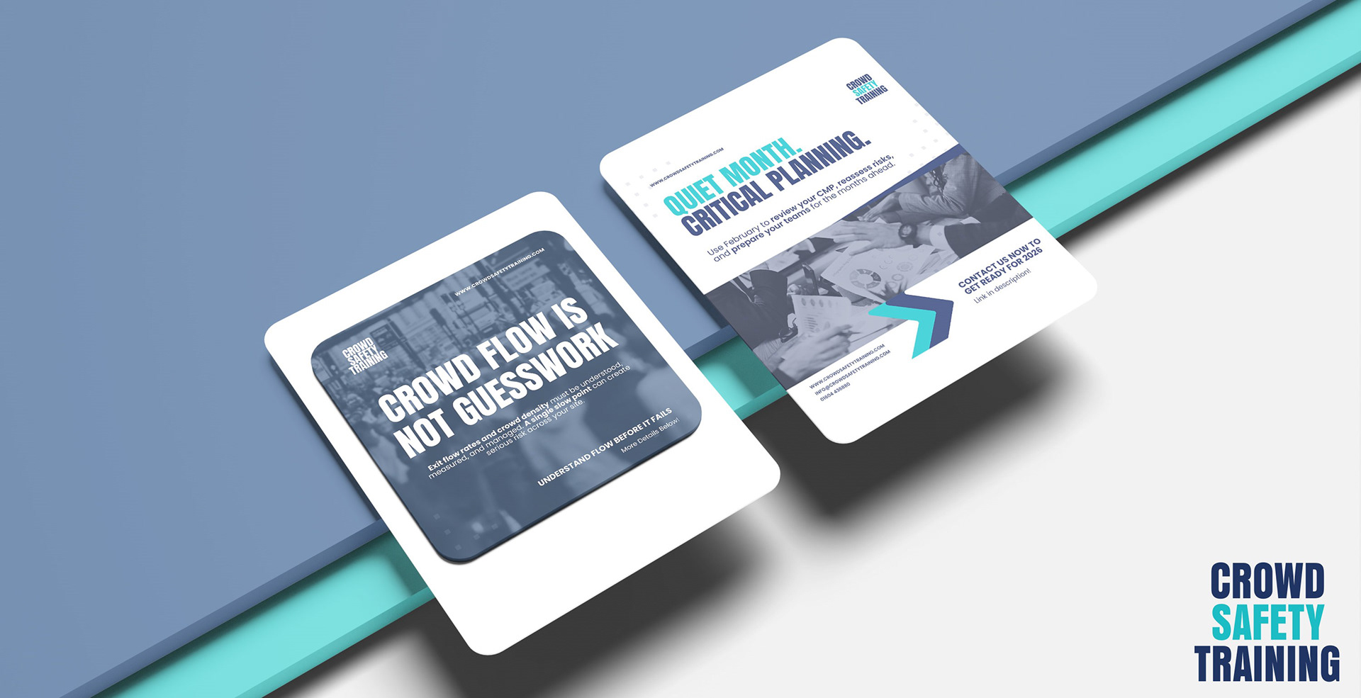
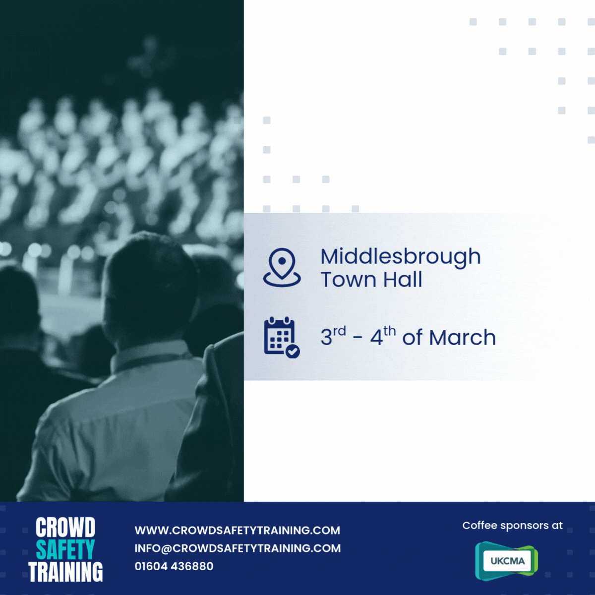
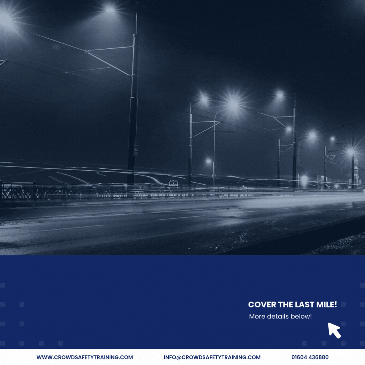
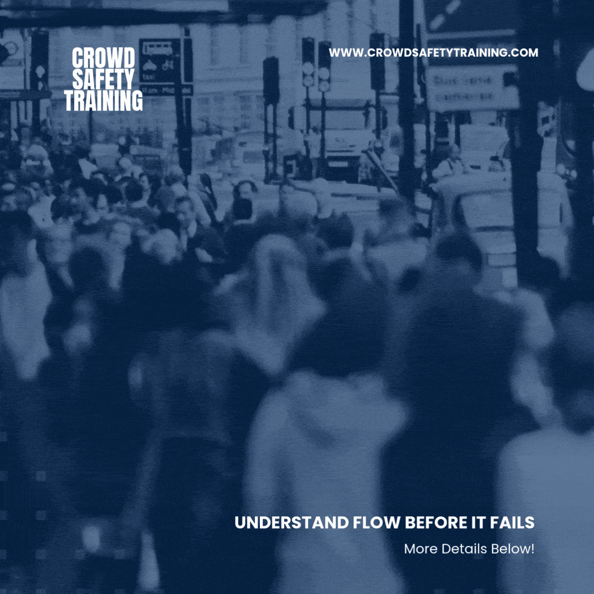
Social Tiles:
This set of social media tiles was developed to strengthen Crowd Safety Training’s digital presence through clear, consistent, and engaging visual communication. The designs focus on simplifying key messages and presenting training information in a format that is easy to absorb within fast-paced social feeds. A cohesive visual system was applied across all assets, using consistent colour, typography, and graphic elements to improve brand recognition. Motion played an important role in increasing engagement, with subtle animations and short-form video elements used to capture attention and add depth to the content. These included dynamic text, animated overlays, and moving imagery, helping to bring context to the subject matter while maintaining a professional tone. The result is a set of assets that effectively supports awareness, reinforces credibility, and encourages interaction across digital platforms.

Thank you for reading!